About the client
The Washington State Department of Commerce (WA Commerce) is the one agency in state government that touches every aspect of community and economic development: planning, infrastructure, energy, public facilities, housing, public safety and crime victims, international trade, business services and more. WA Commerce works with local governments, tribes, businesses and civic leaders throughout the state to strengthen communities so all WA residents may thrive and prosper.
Accessibility is the key to human-centric design
Black Antelope was entrusted with developing a new online presence for WA Commerce, working in collaboration with Anthro-Tech, an award-winning consultancy with over 25 years of expertise in human-centered design and accessibility. Renowned for its work with government agencies and non-profits, Anthro-Tech brought their expertise to the project, ensuring accessibility remained a top priority.
With a combined total experience in design and development of well over 50 years between the team, and a dedication to remaining at the forefront of best practices and standards, Black Antelope places accessibility at the heart of our process and ethos. We understand that accessibility standards are ever-evolving, and so too is our commitment to staying at the forefront of best practices. By prioritizing accessibility, we help ensure that websites are inclusive, enabling them to reach a broader and more diverse audience.
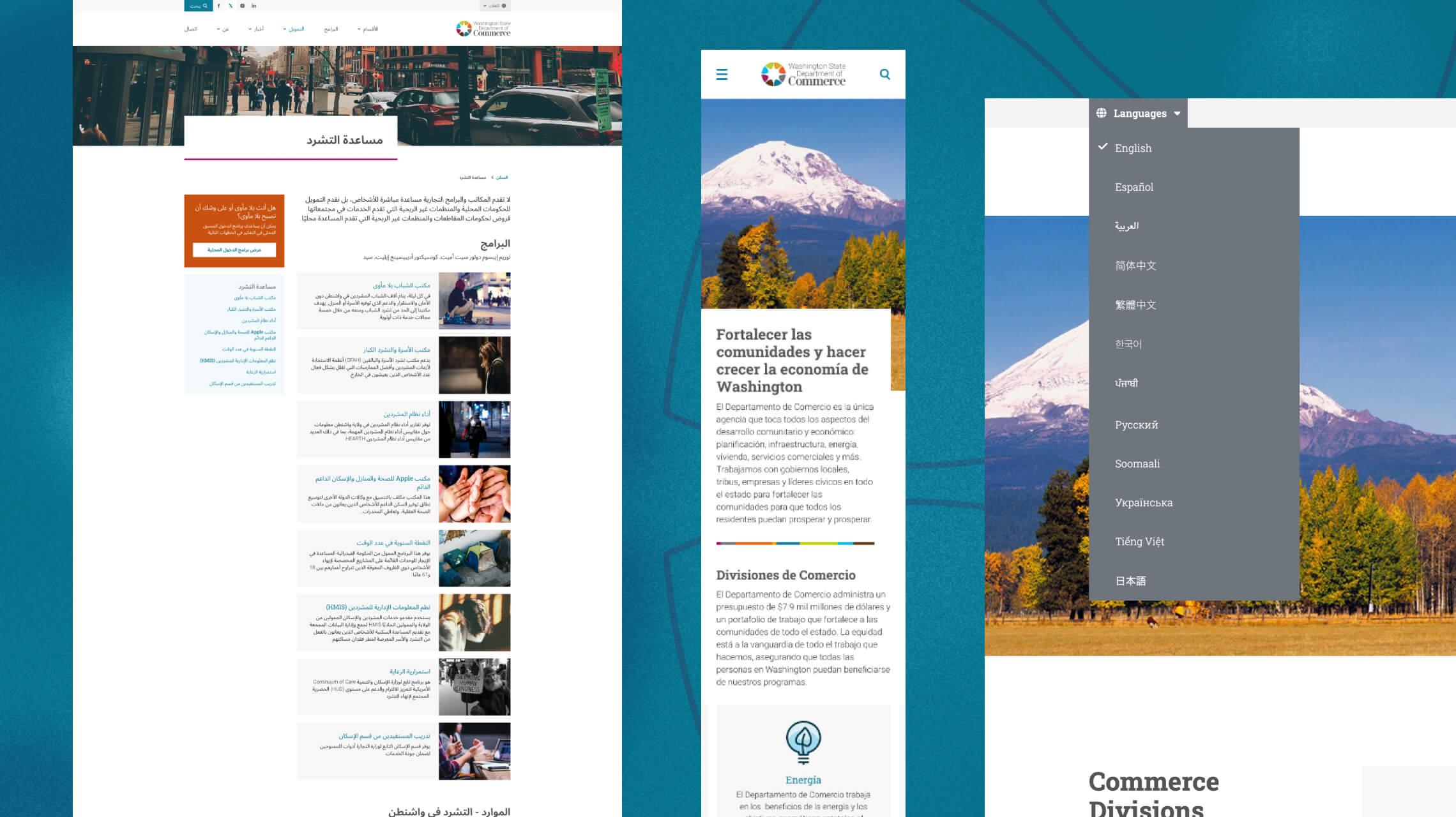
For WA Commerce, accessibility is not just a technical requirement but a vital necessity. As a government website aimed at connecting with people in need of housing, those experiencing homelessness or unemployment, and individuals starting business ventures, it’s crucial that the site is as inclusive and user-friendly as possible.
Our process begins with an internal review of page designs to ensure they meet the requirements of the client brief. Once refined, these designs are presented to the client for feedback, revisions, and approval. This iterative process starts with the homepage, which establishes the global style guide, visual tone, and overall direction. Once the homepage is approved, we develop the full desktop suite, followed by the mobile suite, ensuring a seamless experience across devices. The project then moves into production for the build phase, where the designs are brought to life.
Benefits and challenges of multi-agency design
The extra layering involved incorporating an additional review period where Anthro-Tech would oversee designs throughout the process, providing recommendations and suggestions for compliance and best practices for accessibility at the highest level to meet WA Commerce’s needs and their audience expectations.
This would of course add time to any project, so In order to ensure that we met our timeframes and deadlines, we decided to split the project down even further - still starting with the homepage but then breaking down the full suite and mobile pages into more digestible batches, for the client but more for Anthro-Tech to review internally as a team and return with recommendations where needed.
Our own experience in UX and accessibility helped to ensure that the time spent on these reviews was greatly reduced and ultimately a handful of new best practices were provided. Figma also greatly helped in the review process to easily track revisions, and feedback across a project that ultimately spanned well in excess of 100 page designs and variants.
However, an additional challenge was identifying what recommendations are more important to accessibility without compromising on a balance of story telling and compliance. Some best practices are typically set in stone at this point in design history, or an easily acceptable rule of thumb, such as:
- Strong shape and color contrast for hyperlinks allow easier identification of a link on a page, such as a significant change in text color between body text and a text link, or displaying an underline by default then removing it on hover.
- Descriptive hyperlinks ensure that screen readers will accurately identify what a link pertains to. For example, incorrect use would be: “It’s important to meet accessibility standards. Learn more.” versus the correct method: “It’s important to meet accessibility standards.”
- AA/AAA color contrast compliance ensures that content is as accessible and legible for audience members with a visual impairment as it is for those without. Having a sufficient contrast between foreground and background colors is crucial for allowing this to happen, whether it be text on a background color, or a message overlaid on top of a vibrant image. Brands often need to be flexible with color for their online presence if it was an afterthought initially, as many brand colors do not typically meet contrast compliance without consideration, and need to be adjusted to meet these requirements.
- Perhaps a lesser-known recommendation is limiting or removing the user of uppercase text from websites as it can be much harder to read, with italics being very difficult for people with dyslexia to parse.
These are just a few examples, many more can be found on the US Web Design System’s website. But even there, some recommendations are still debatable even by the US Web Design System, particularly the use of accessible typography for the visually impaired.
Typography - balance vs compliance
Accessible typography and font usage is less set in stone, it is still debatable whether serif fonts with their more unique and distinguished character accents (considered more appropriate for large blocks of text), or sans serif typefaces that are more appropriate for UIs by aiding user focus when using the interface. Accessible fonts are those which make content easier to read, by making it simpler to distinguish between the shapes of different characters and individual letters. For a more detailed explanation, please visit Google’s website article on accessible fonts for readability, with some pointers below:
- Mirroring of characters makes it difficult for readers because it looks like another character when flipped, such as “b” and “d”, or “6” and “9”. Character tails or height often give suitable variation here.
- Character differentiation helps letters look distinct from one another, with accessible fonts having clear differences between ‘imposter’ letter shapes, such as upper case “i”, lower case “l” and the number “1” which can look the same next to one another.
- Letter spacing is also key to an accessible font as each font has their own native width. A tightly packed font can create barriers for certain readers, particularly those with dyslexia.
However, to adhere to these recommendations entirely would drastically reduce the number of truly accessible fonts, as many do not fit all of these requirements. For example, Roboto, Google’s own developed UI font that is still used as the default for Android systems, Samsung apps, and heavily used on government websites across the globe, and was ultimately used for the final WA Commerce designs. Despite its popularity and recommendations from multiple sources for its accessibility, it still doesn’t meet all the recommendations at the highest level of accessibility.
Finding a balance in design and accessibility without restricting the user or online experience is vital. To that end, the font families used for WA Commerce offer a high level of accessibility, meet the needs of the brand and offer a clean, spacious and easy to read content experience for the audience and screen readers alike.
Brand awareness
Having branding that already has a well-established system for print and web color consideration is always ideal, so that what the client expects to see of their brand on their new online presence meets what they are used to in other mediums such as print literature, exhibitions and general branding. While this wasn’t the case for WA Commerce, who had yet to define web colors suitable for AA contrast compliance at a minimum, they were more than accommodating when we suggested using AA alternative values and aware of the need to be as inclusive as possible in this regard.
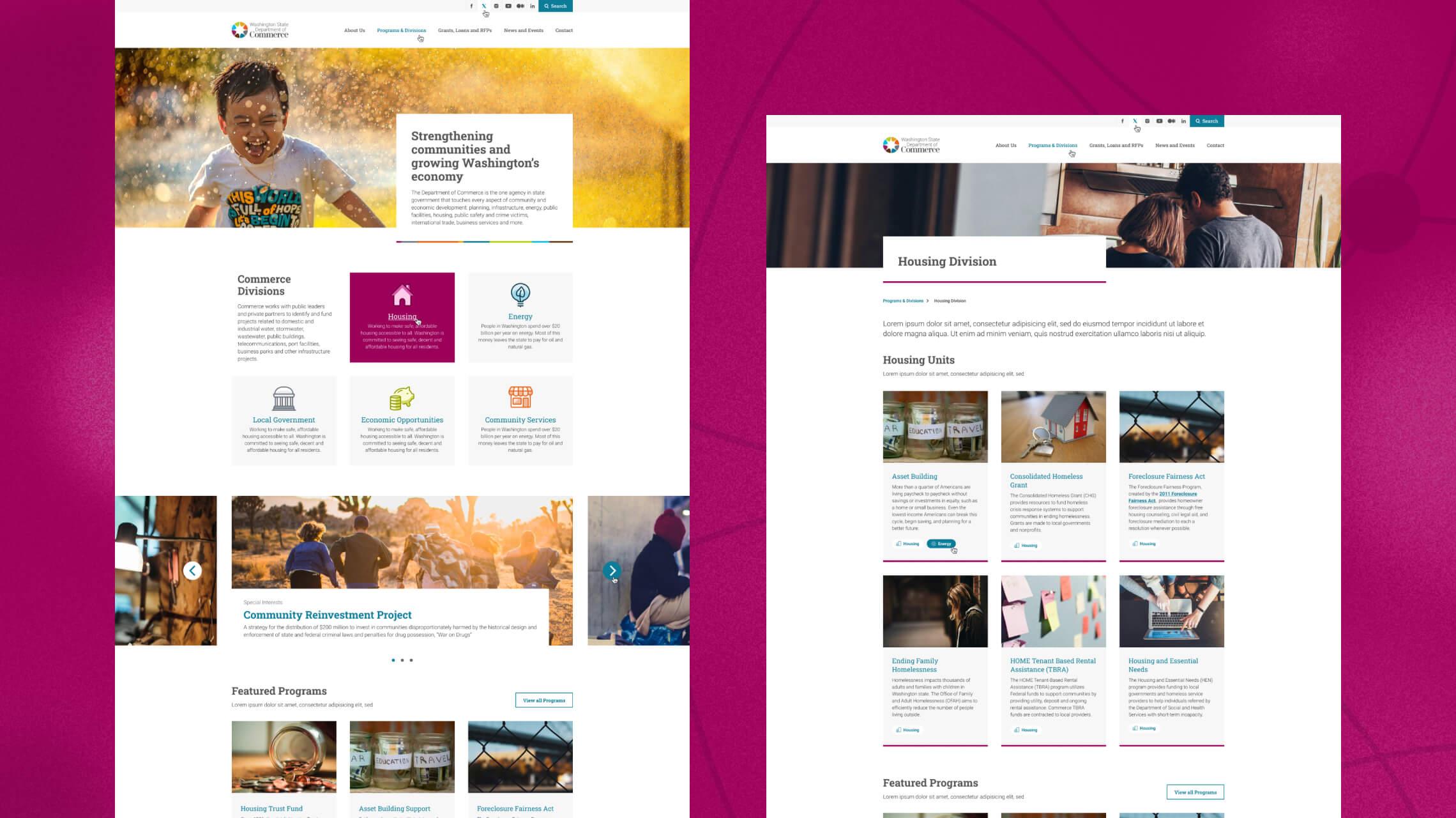
As a result, we kept the core values wherever possible such as graphic accents or areas where they would not interact directly with text, and used complimentary darker/richer tones to meet that contrast need. The original website used a mix of black and orange text and accents, for the new site we focused on making the brand blue the definitive link color, with the rest of the palette used to accent and distinguish each department division to further strengthen the bond between brand and the new website.
Restructuring for a modern audience
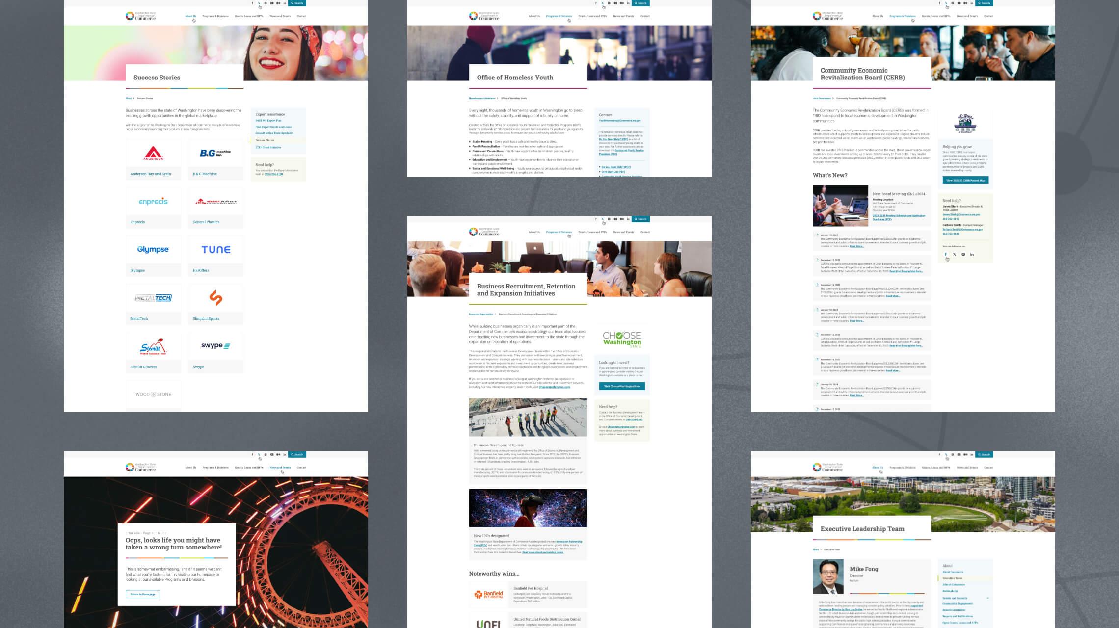
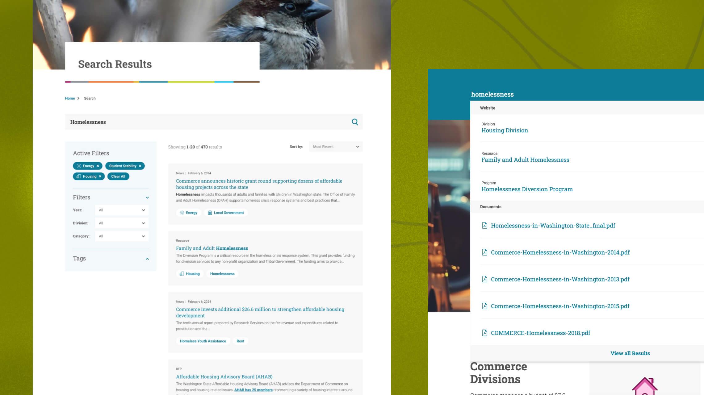
While the bulk of the existing content and page set were carried across to WA Commerce 2.0, at key stages of the project was considerable restructuring, including the full sitemap for a more streamlined user experience, getting the audience to the required information faster, easier and much more intuitively. This was at a division and navigation level, but during the design phase we also gave great effort to improving and identifying ways to elevate often extremely text-heavy page content:
- From the homepage, a large presence at the very start of the page indicates the available five divisions to the user, with bespoke, color complimentary duotone icons used to enhance the aesthetic, compliment the rich color palette and draw focus to the divisions.
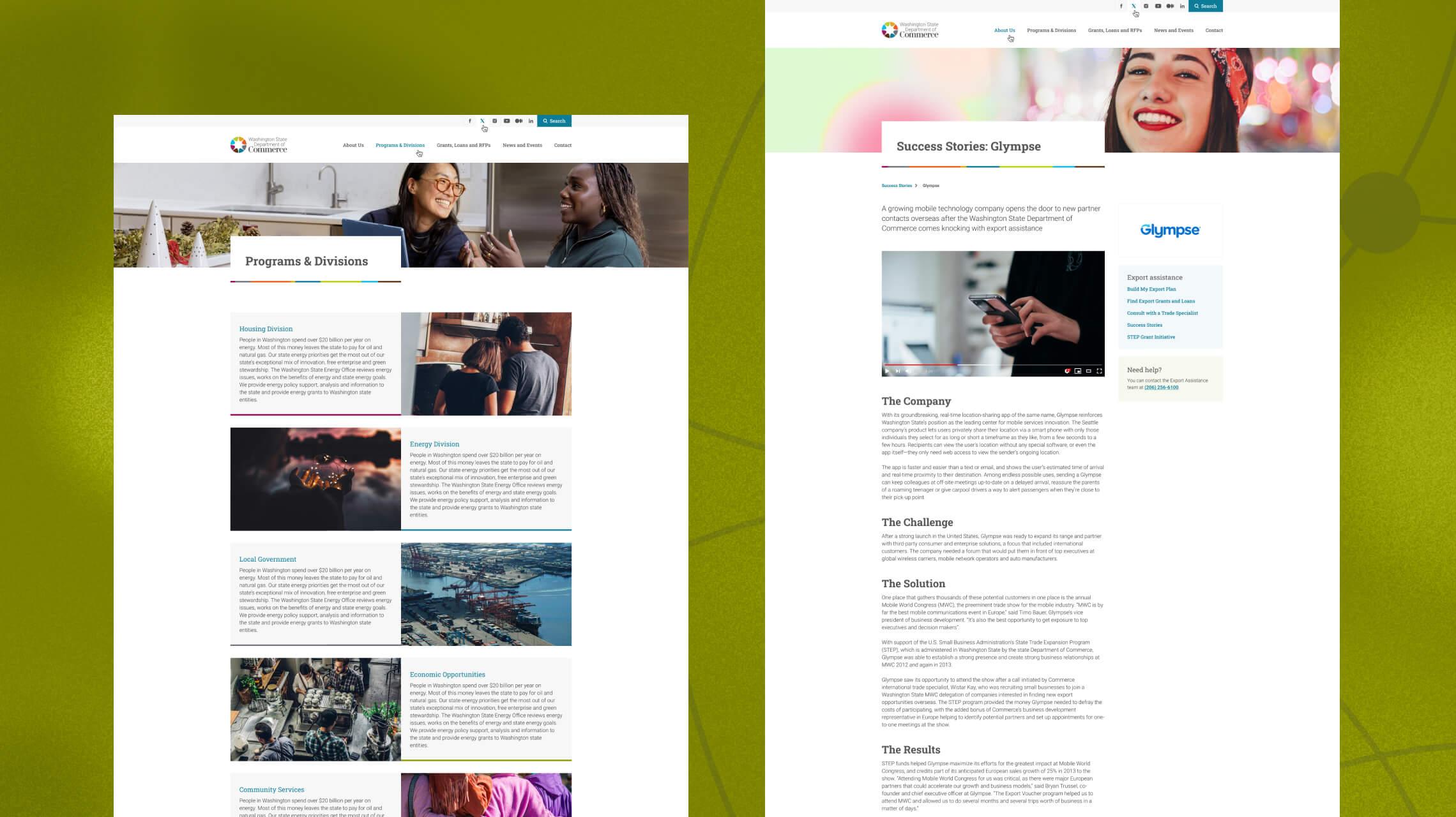
- Landing hubs were created to clearly indicate core areas of useful information for divisions, programs and individual program units to the audience.
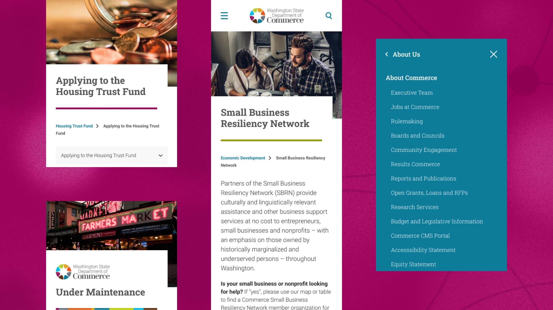
- Imagery for each program and unit were added to elevate content while familiarising the user with the programs themselves, as well as the use of cards, hero banners, new resource and partner logos to introduce simple ways of replacing heavy text areas with simple, clean imagery while not adding significant workload to the client to source an excess of new photography or stock imagery. Each page has at the very least its own hero banner, and if one isn’t provided for a new page, a default set of hero banners related to each available division was created as a backup.
- The original website heavily relied on accordions and hidden content to help reduce the volume of content on a page. To overcome this challenge without adding a significant amount more to a page, we utilised a mix of side navigation allocation, anchor and jump-to drop-downs to navigate across the page, and a cleaner separation of sections with the use of white space, clearer headings and block panelling.