The Department of Statistics at UC Berkeley was one of the first established centers in the US for statistical research, and has one of the top two statistics graduate programs nationally.
Their previous website was an older version of Drupal that needed to be migrated, and the site was also in need of a redesign.
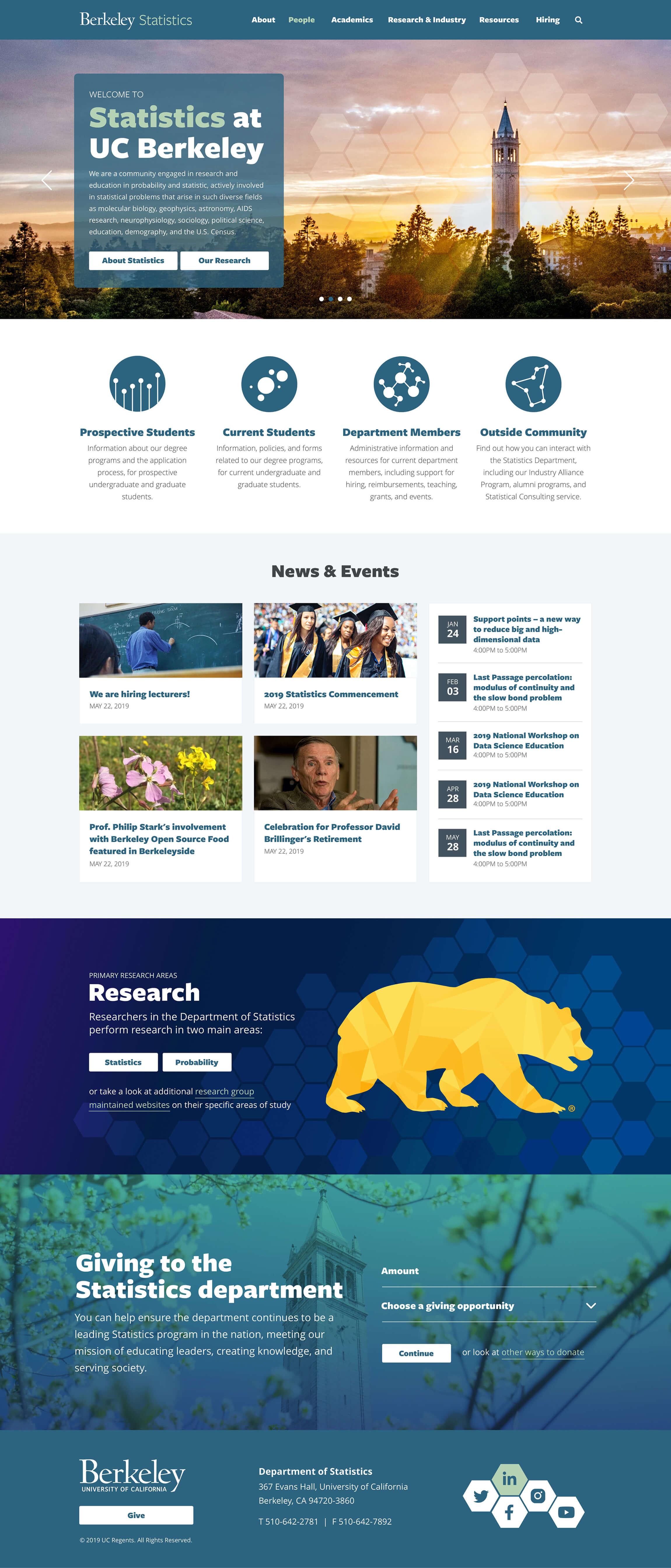
One of the major goals for the redesign was to introduce audience-driven navigation, so that relevant content would be easier to find for the department’s different audiences including current students, prospective students, faculty and staff, alumni, and industry partners.

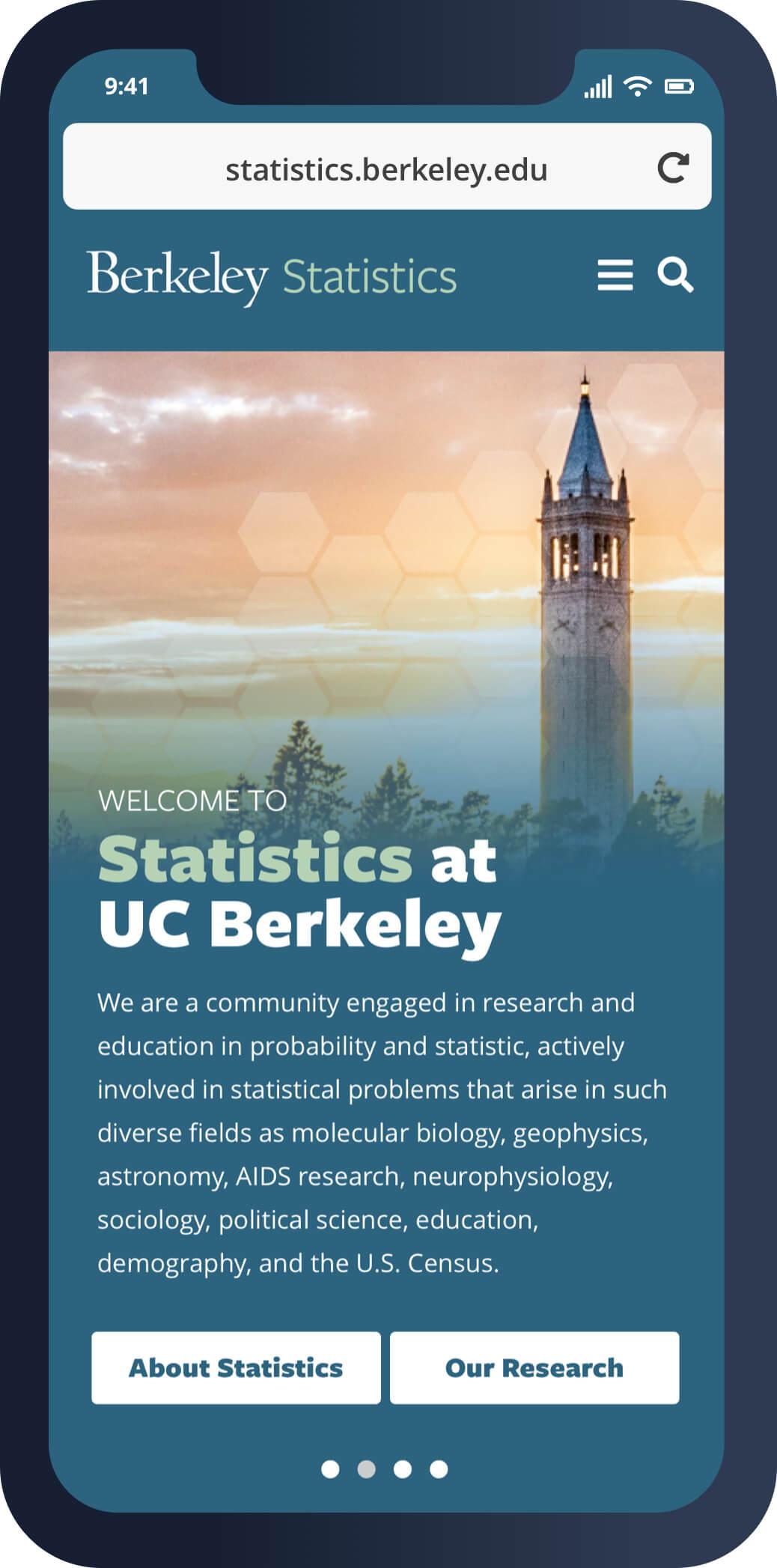
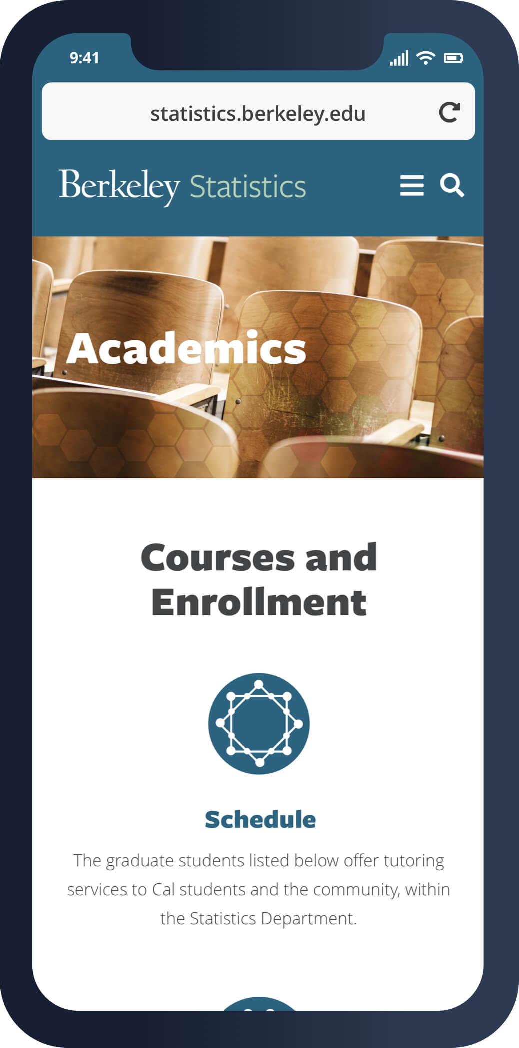
The new UCB Statistics website has been redesigned from the ground up, to be as usable via mobile devices as the desktop version, to meet ADA WCAG 2.0 AA accessibility requirements, and to cater more-clearly to the various audiences.
To give the site its own unique twist among the land of academic department websites, we employed a graphical motif across the site called hexagonal binning, which is a visualization tool used in data analytics. For landing pages and major sub-section menus, we also used simplified visualization graphics to bring in something uniquely statistics.


