The Othering & Belonging Institute at UC Berkeley is dedicated to advancing equality for all, fostering interconnectedness, and addressing our collective relationship with the environment. As a central hub, it brings together researchers, community organizers, policymakers, and other stakeholders to collaborate on building a more inclusive and equitable society.
Black Antelope was entrusted with a complete redesign of the Institute’s website, reimagining its structure and content to better serve its mission.
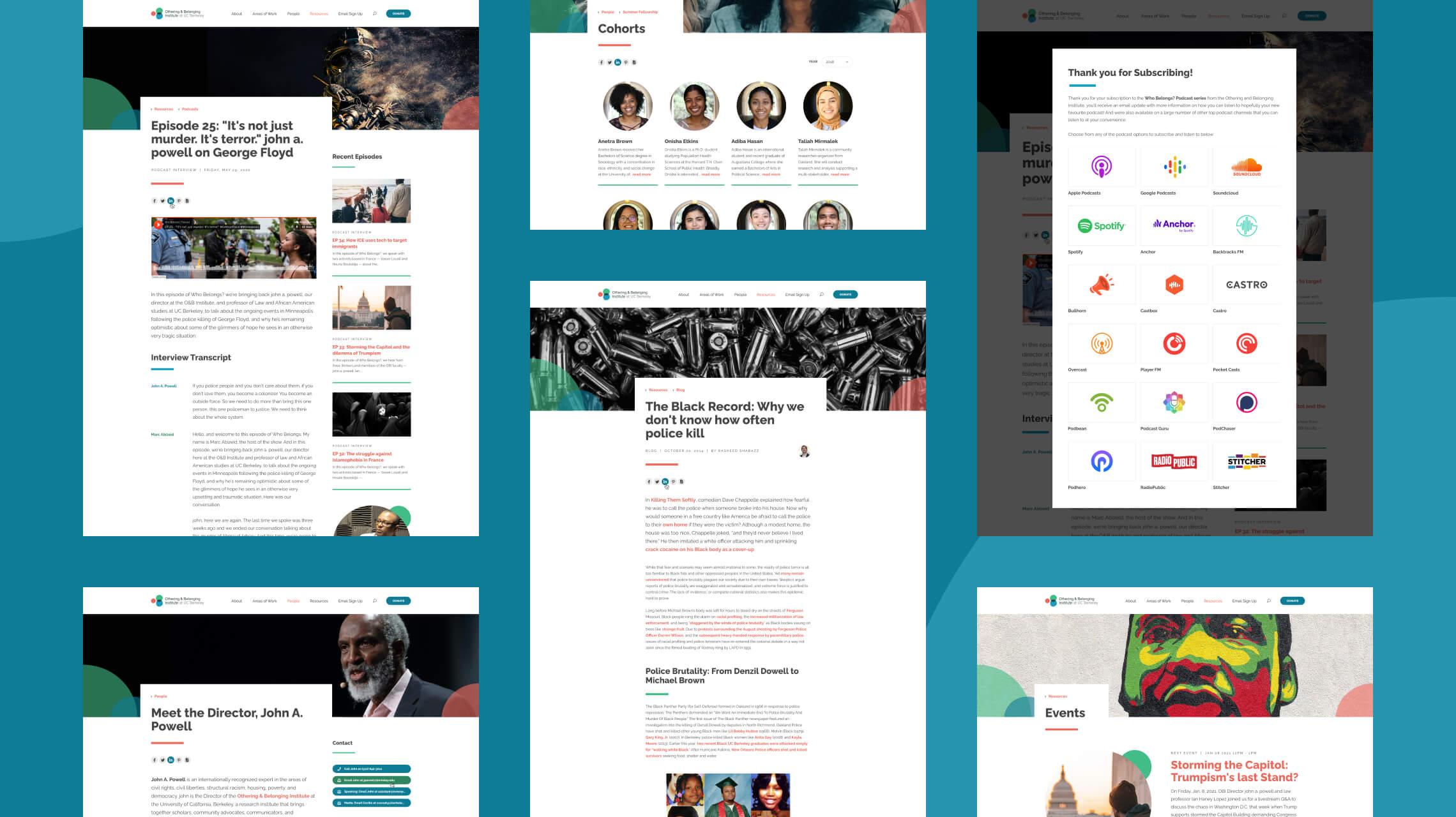
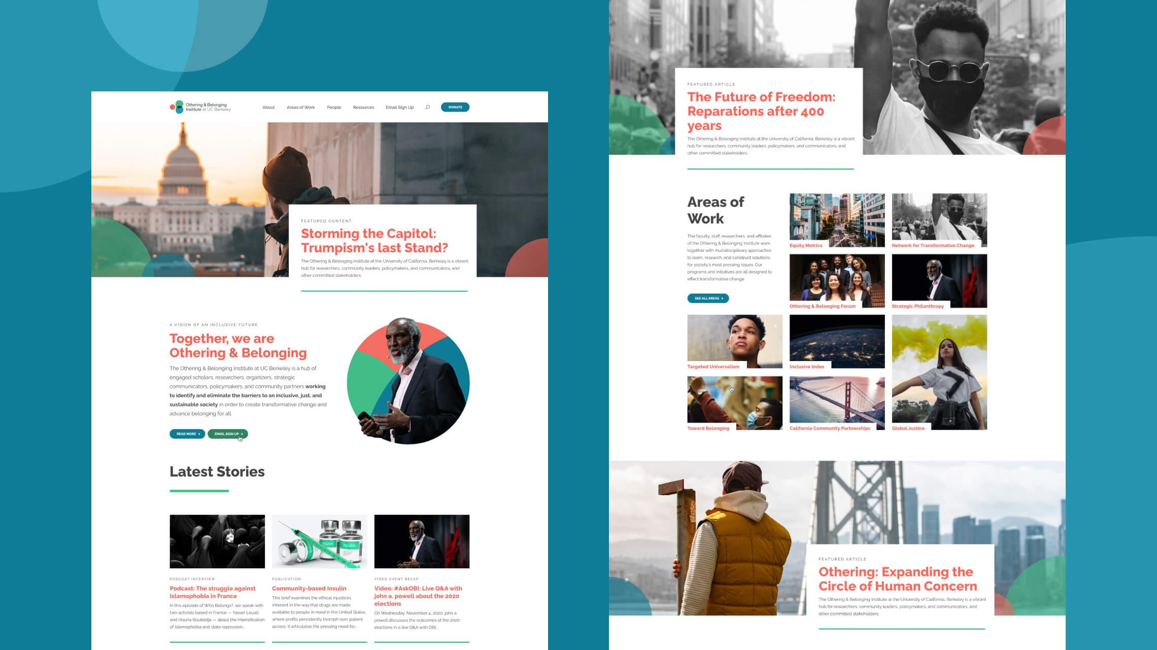
It all starts at home
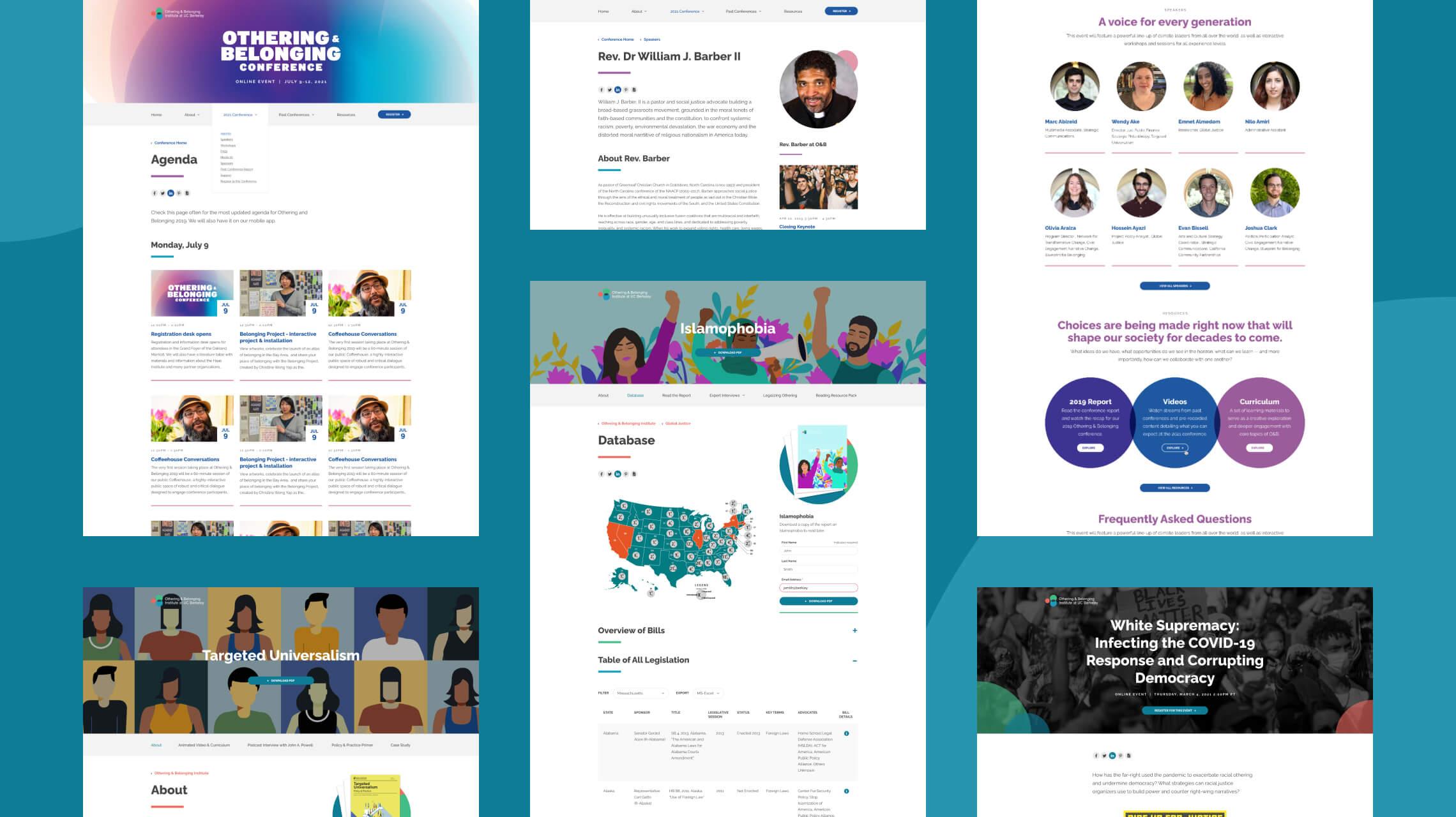
The homepage is typically the first page we seek approval on during the design process, as it serves as a global guide for the entire design suite. Much emphasis was given to the O&B homepage, as it needed to function as a central hub. This meant not only highlighting key areas of work and persistent features but also being adaptable enough to showcase regularly updated content blocks and featured articles. The design had to balance flexibility with structure, ensuring it could effectively tease and promote the unique sections of the site while remaining visually cohesive.
Impactful message, impactful design
The messaging and information provided by O&B needed to resonate with and engage their audience effectively. From our initial concepts to the final designs, we prioritized creating a clean, visually striking layout. Generous white space was incorporated to ensure the content remained the focal point, with ample breathing room. Large imagery, bold font weights, and varied font sizes were used to emphasize key areas of practice and highlight content across the new website.
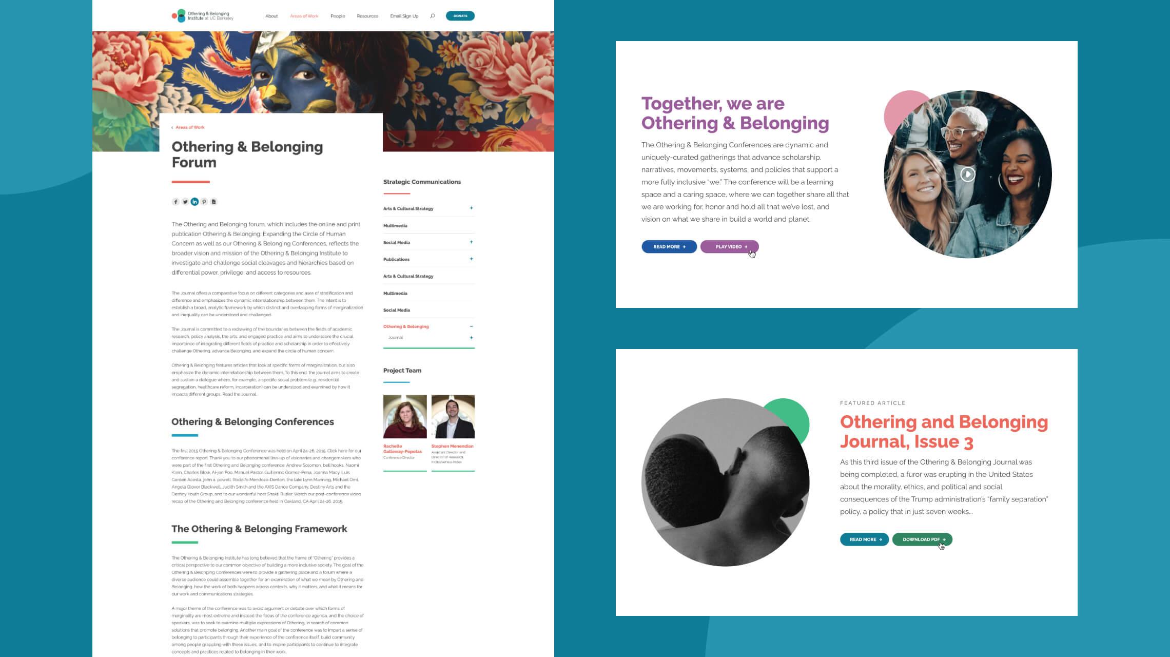
We leveraged O&B’s existing branding and color palette to create a seamless connection between the new online presence and their established identity. Accent colors were strategically used for impact: the brand blue was applied primarily to button links, while the brand peach highlighted hyperlink text and titles. This tri-color scheme was implemented globally, ensuring visual consistency while making calls to action easily identifiable on every page.
Stock imagery was thoughtfully selected to align with the tone of the site and meet audience expectations. Additionally, there was a deliberate emphasis on incorporating significantly more photography than the original O&B website, enhancing the messaging and creating a more compelling and visually engaging narrative.
Fully responsive inclusiveness
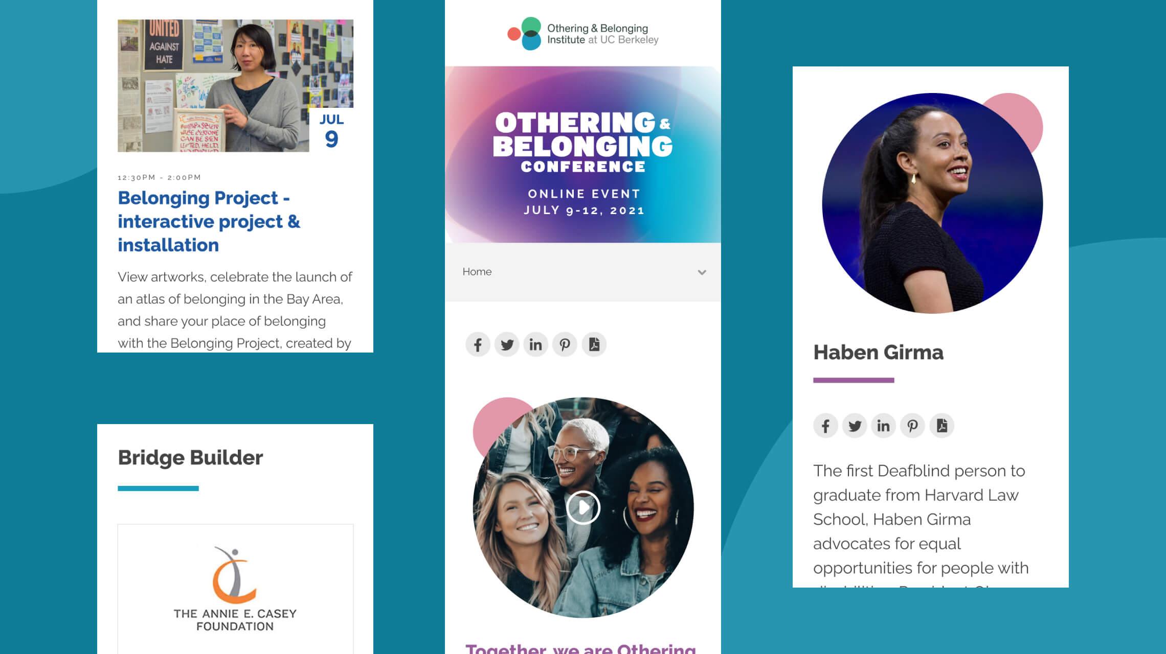
The user experience needed to be seamless across devices, addressing challenges present in the original website. During the initial brainstorming phase, we simplified the navigation structure, organizing content into clear and concise categories to guide users directly to key areas of interest. Special emphasis was placed on highlighting the option to donate to the institute. This streamlined structure extended to the multi-level hamburger menus for mobile and tablet, effectively accommodating the complexity of the sub-level hierarchy.
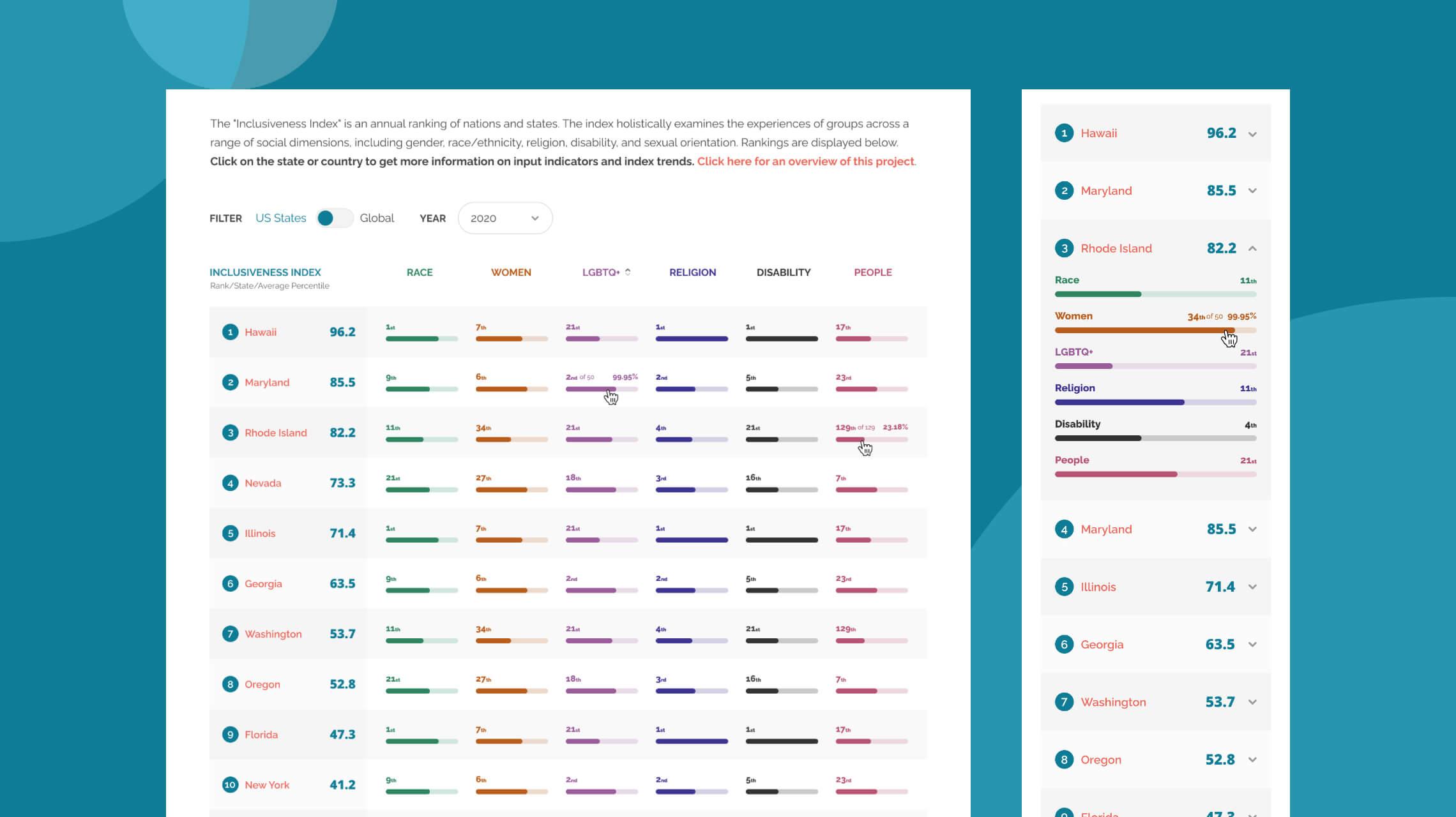
For mobile users, maintaining a 1:1 level of content visibility was critical, especially for text-heavy articles, lengthy tables, accordion content, and the intricate graphical tables of the Inclusiveness Index. This annual ranking examines the experiences of diverse groups across social dimensions such as gender, race/ethnicity, religion, disability, and sexual orientation. Beyond updating its appearance, we restructured the index to enhance usability, incorporating ranking overlays, color-coded categories, and new filtering options to make the data more accessible and engaging.
Additionally, lightbox overlays displaying advanced indicators and statistics for each state required careful adaptation for mobile. These elements were redesigned to fit full-width, single-column formats, ensuring they remained intuitive and visually effective across all devices.
Microsite development
A key new requirement for O&B was the ability to effectively showcase time-sensitive content within their ever-expanding website while ensuring it remained easily discoverable. To address this, Black Antelope proposed concepts for external landing pages and hub microsites designed to give exclusive focus to specific content. We developed a range of easily editable layouts and templates that O&B could use as a foundation for upcoming or recurring events. These included single-page designs for smaller events and more comprehensive hub sites with tabbed navigation for larger-scale content.
For example, single-page templates were tailored for local and online events like the Spring Virtual Summit, featuring attendee information, pricing, moderator details, and registration capabilities. Larger microsite hubs, such as those created for O&B’s annual Online Conference, included their own secondary color schemes and tabbed navigation. These hubs highlighted unique content blocks and statistics relevant to the event, providing a rich and tailored experience for users.
Although these external resources are effectively independent from the parent site, they adhered strictly to the style guidelines and structure established in the new design framework, and are managed within the same CMS. While some microsites incorporated distinct color schemes, the visual language and user experience across all online presences remained cohesive and unified.
Black Antelope did a phenomenal job of developing our website, including the CMS and design. They were able to work with anything we threw at them, and the finished product came out perfectly.Marc AbizeidOthering & Belonging Institute @ UC Berkeley
Visualization design
There are several special projects that have required a great deal of consideration in terms of both UX design and visualization design. Among them is the Climate Refugee Database, an interactive map that aims to be ‘powerful and persuasive research tool that demystifies and targets the root causes of climate-induced displacement.’
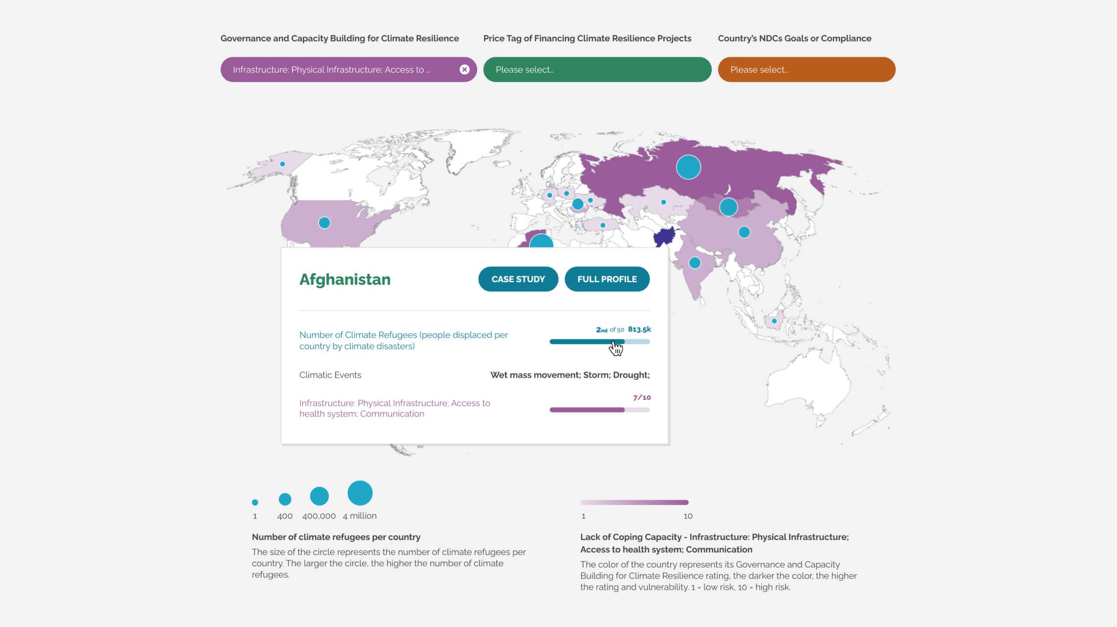
We were able to use variants of existing design language to define the main sections of the microsite such as the landing page, article rivers and resources. But for the unique interactive map itself, a lot of collaboration was required to ensure we were addressing all the needs of what the database needed to depict to its users in the map visualization, and that it was as intuitive as possible. The map needed to show fixed data such as the number of climate refugees per country, and also allow the user to refine the display by a number of unique indicators. Each country has its own customizable profile page with a full breakdown of its unique metrics and rankings, along with associated case studies for any country that had them.
Another special data visualization project we designed was for the Inclusiveness Index. This project evaluates the degree of inclusivity experienced by marginalized groups both globally and within the United States. This annual index ranks countries and U.S. states using various indicators that measure institutional inclusion and protections for vulnerable populations across social divisions such as gender, race, ethnicity, religion, sexual orientation, and disability. Unlike other assessments that may conflate inclusivity with economic conditions, this index uniquely focuses on inclusivity as a distinct measure, providing insights into how different regions support marginalized communities.